Web design, Illustrations & Icons: HighSpeedOptions
HighSpeedOptions is your one-stop shop for internet and TV plans, whether you want to compare bundles or know exactly what speeds you need for your daily internet activities. As both the visual and product designer, I was tasked to redesign a couple of web pages, illustrations and an icon library.
What I did: UX/UI, Illustrations, Icons
Problem
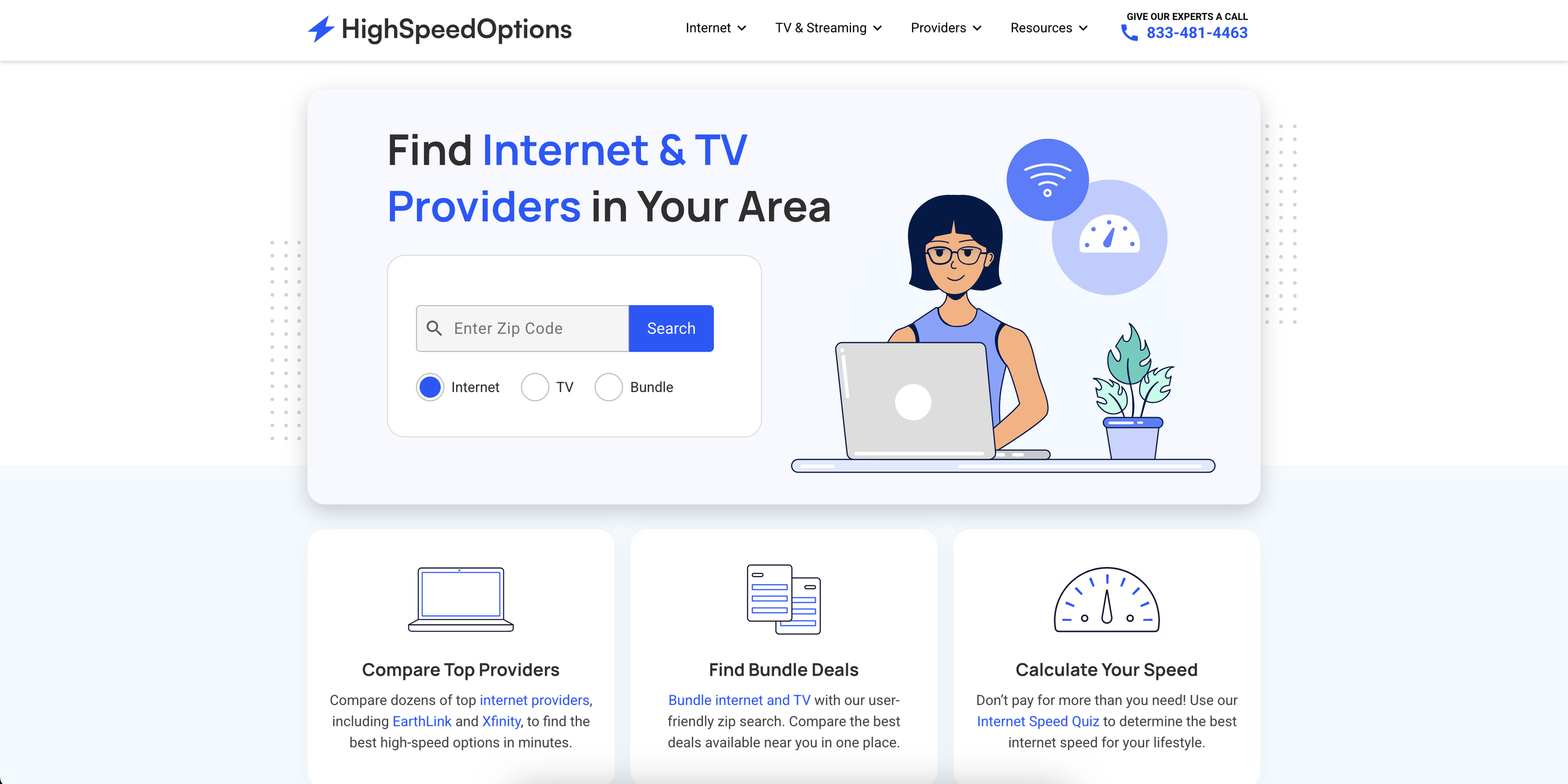
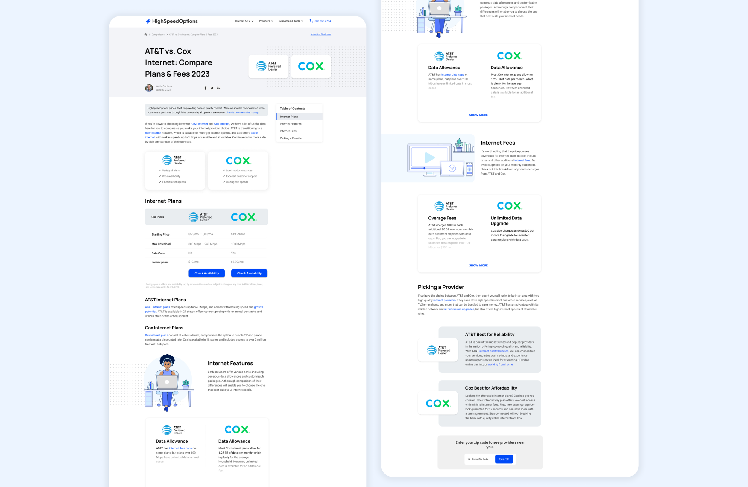
The HSO comparison pages were both lengthy and lacked side-by-side components for the user. There is no specific tool to filter which providers the user wishes to compare. On top of improving this specific page, HSO lacked icons and illustration that matched their new branding and style. We saw that more than 60% of users were exiting the page after scrolling on the hero image on both desktop and mobile. Due to the lack of scrolling, users were not interacting with the page nor clicking on the links.
Solution
I redesigned the comparison pages with multiple components so the user can get a better understanding on both providers. I also created a dedicated tool on a single page for users to select and compare specific providers, housing all comparison pages in one place.
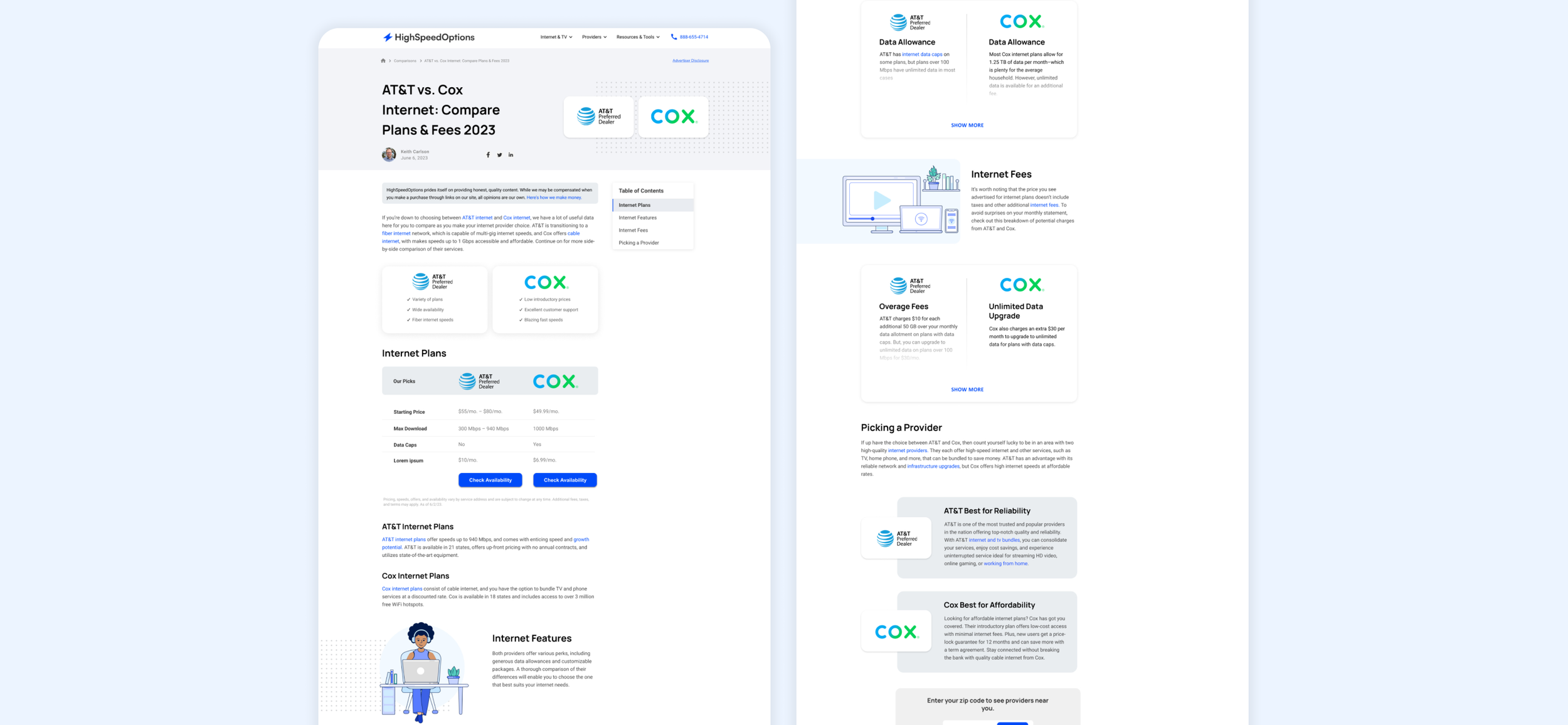
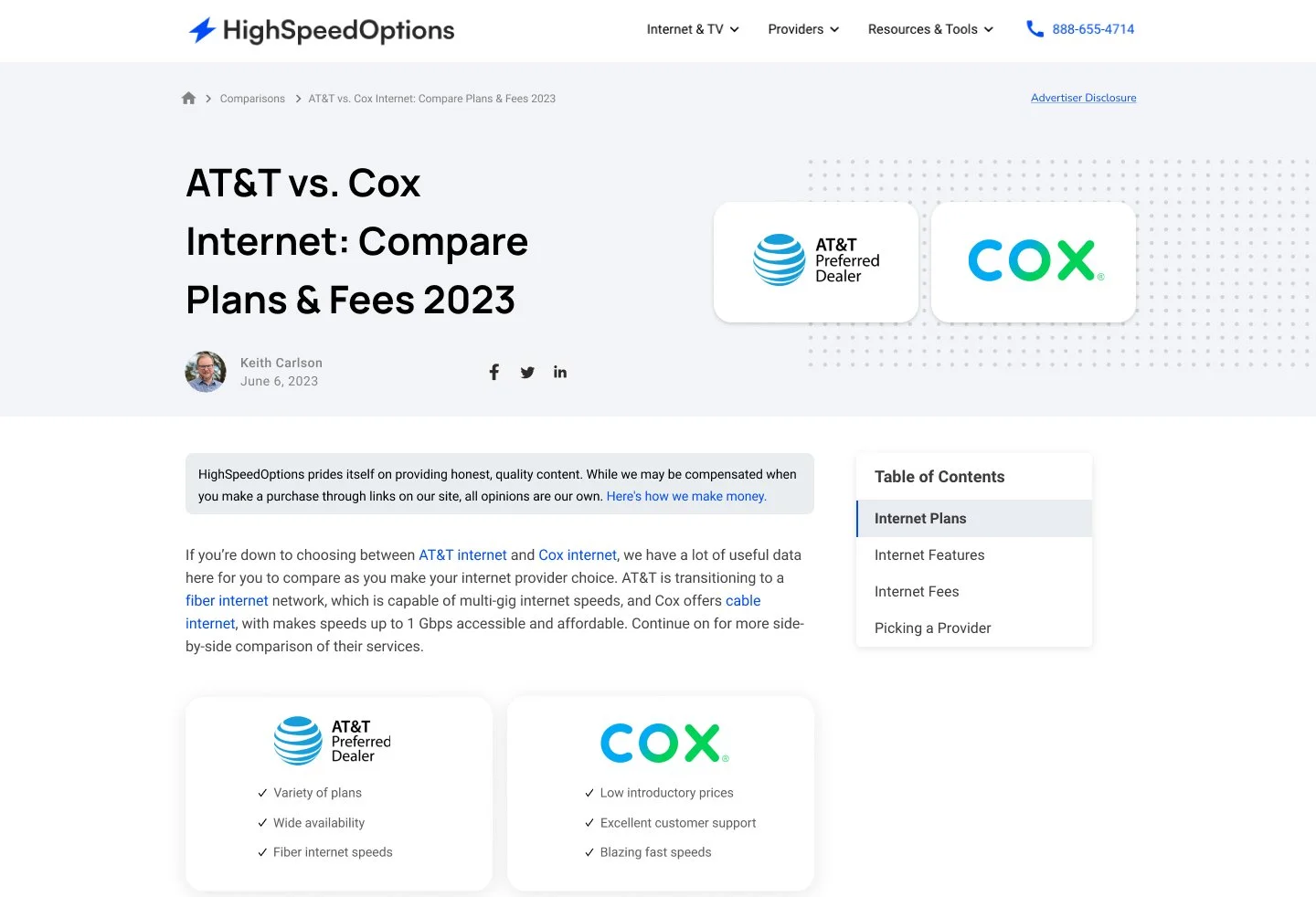
Elevating content & visuals
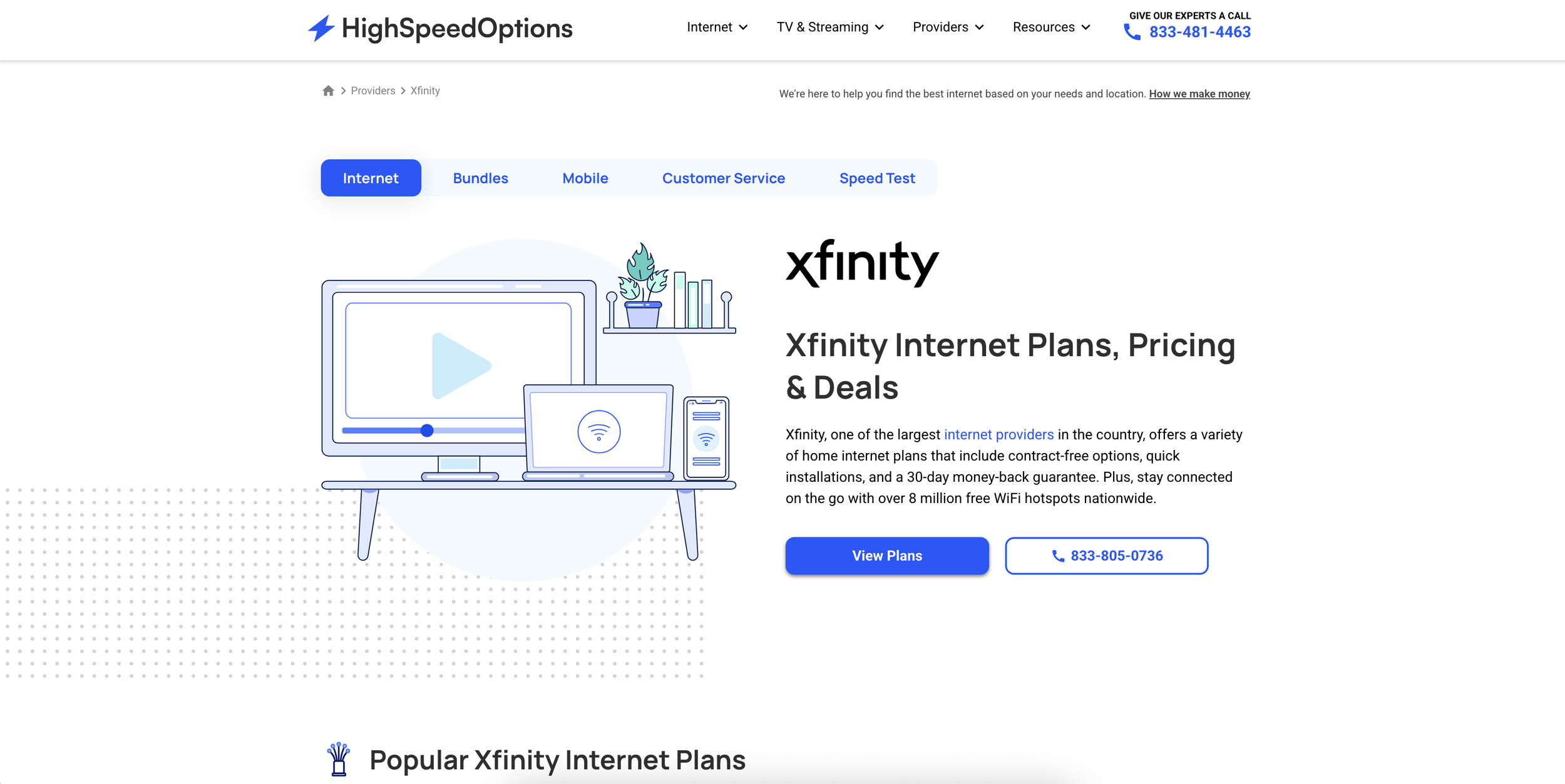
The HSO comparison pages allow viewers to compare two providers at a time. I was tasked to redesign the comparison pages so the Copywriter can utilize it as a template and create content involving multiple providers for ours users. The goal was to make these pages digestible on both desktop and mobile.
Throughout my research (utilizing the tool HotJar), I noticed there wasn’t a lot of scrolls or interactions on majority of comparison pages. I redesigned the header section and intro to move up the entire content above the fold. This allows the viewer to receive the information quicker and in a more effective manner.
Previous Design
Redesign
Improving the experience
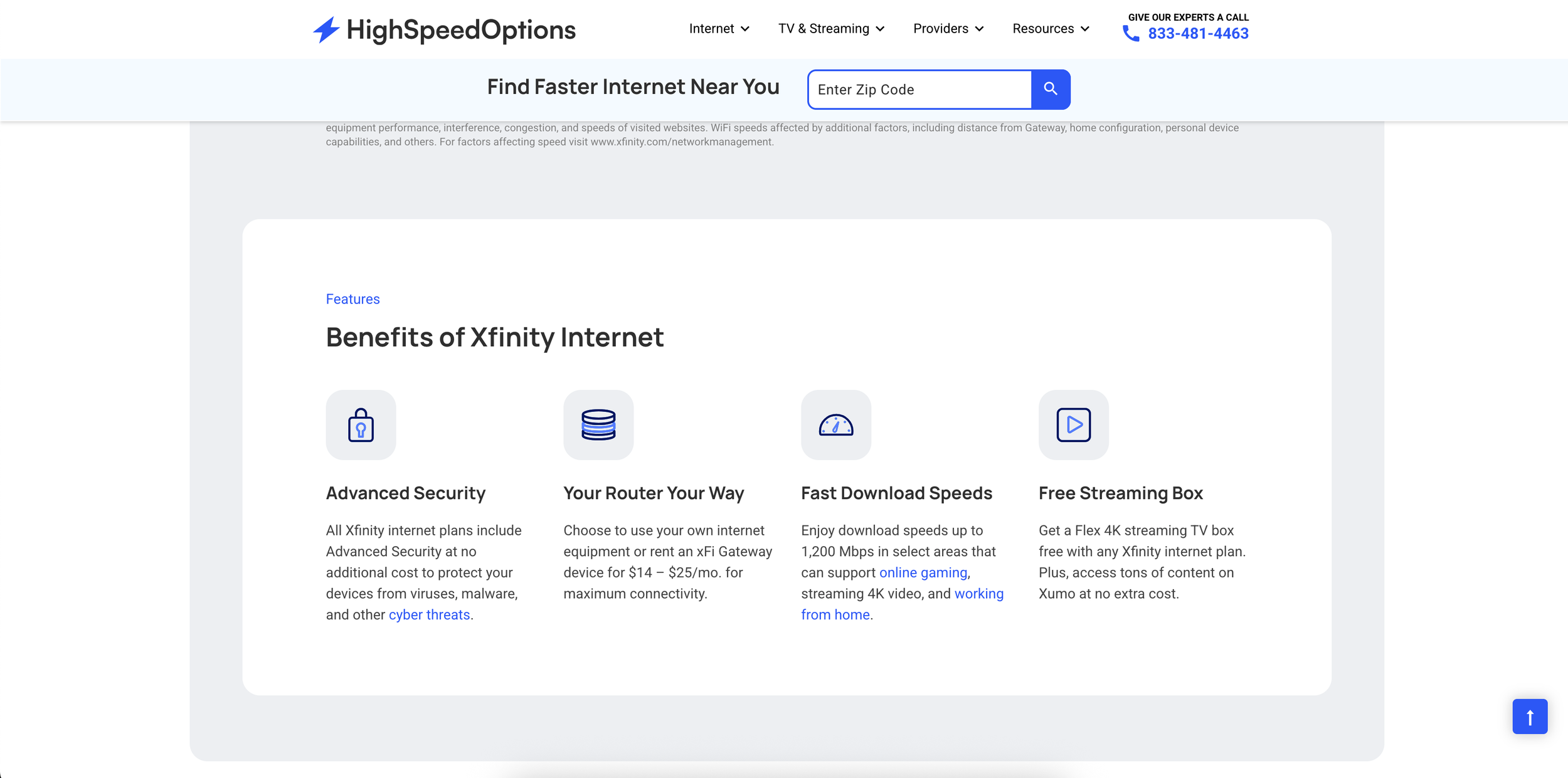
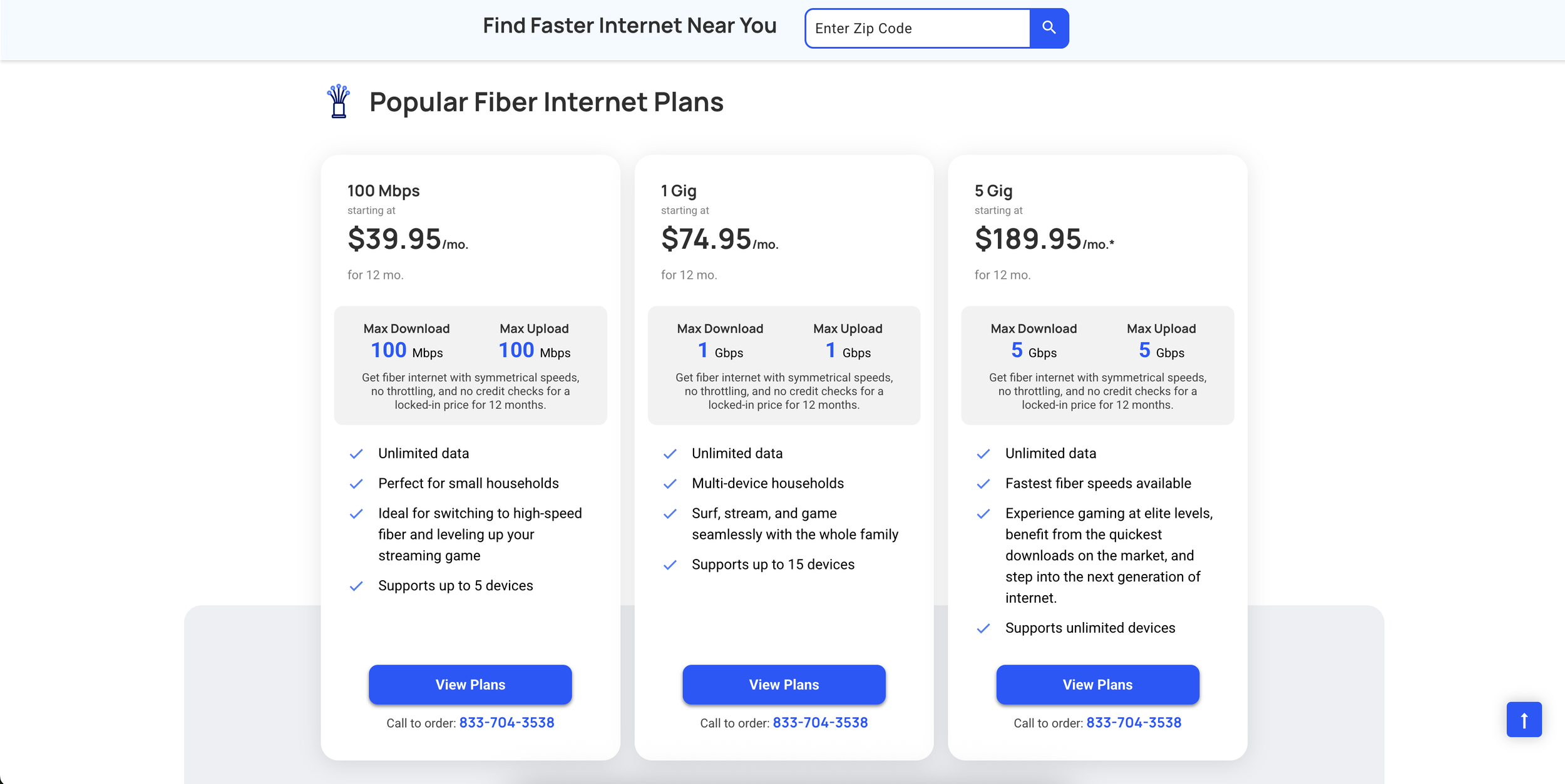
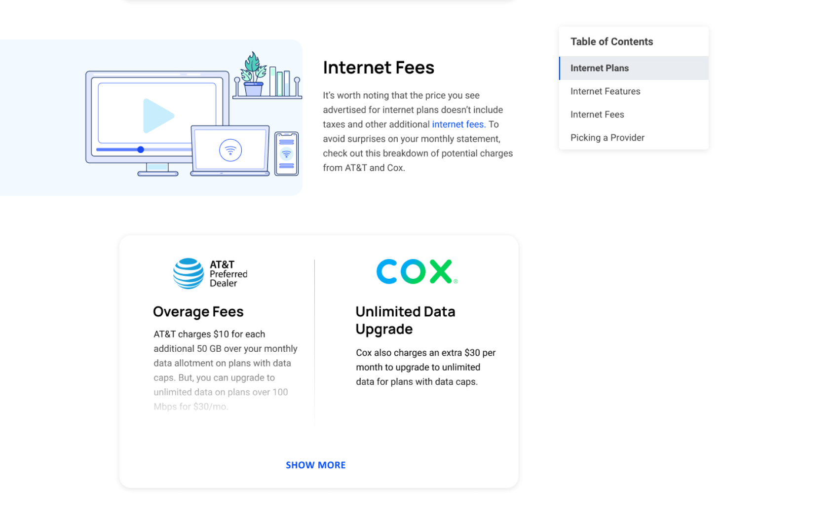
I noticed the previous Comparison Pages were text heavy and had no side by side components. Comparing providers was a difficult process for the viewer due to the format of the entire page. In order to improve the user experience, I added components that allow the viewer to to see side-by-side charts, tables and bullet points. This lets the viewer compare the internet providers in a seamless way.
Previous Design
Lacked side by side components for easy comparison, outdated illustrations & text heavy.
Redesign
Updated illustrations and added multiple side-by-side components
New components
Side by side comparison component
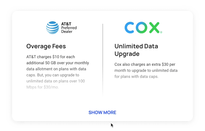
Provider call outs
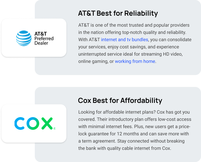
List component
Final Experience & results
More than 50% of users scroll all the way to the bottom (on both mobile & desktop). This lead to more interactions with the internet provider links, zip search, and comparison components
Icons & Illustrations
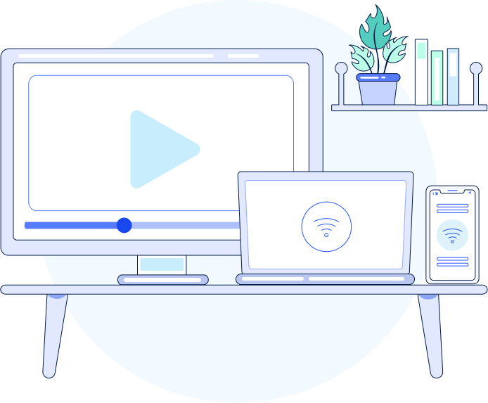
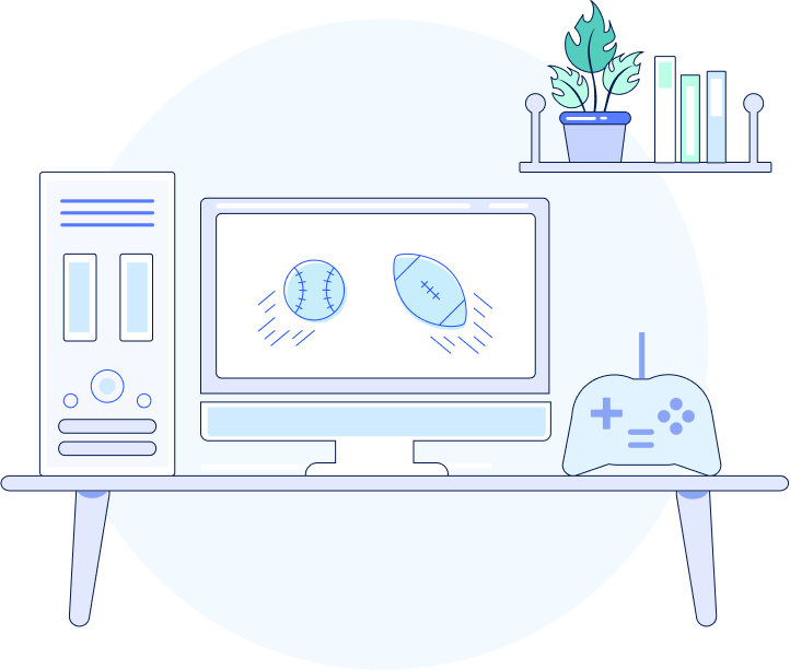
I was tasked with redesigning the illustrations and icons for HighSpeedOptions to match the new brand style and create a more consistent look. The goal was to make the visuals feel more personal by showing people in different everyday situations, like relaxing on the couch or working from home. This way, the designs would better reflect how users interact with the internet, adding a human touch and making the brand feel more relatable and inclusive.
Hero Illustrations


Icon Library
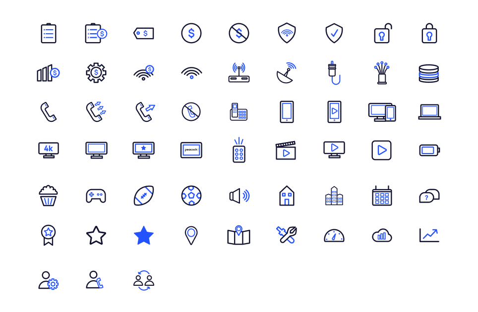
Illustrations & icons throughout the site
Having a unified look for both the illustrations and icons allowed HighSpeedOptions to have a cohesive experience.