Marketing landing page: Super.com Cash Advance
Super.com offers a Super+ membership that comes with various benefits, including access to cash advances. Upon enrollment, users receive a secured Super.com Card. Cash advances are directly deposited into this card, and users can also add funds manually. I was tasked to redesign the marketing landing page to increase both clarity and conversion
What I did: UX/UI Design | Product Strategy
Problem
Data showed that 34.6% of card-related customer care tickets were from users trying to withdraw funds. This indicated a significant gap in user understanding and expectations, particularly regarding how the cash advance feature operated.
Solution
My product manager and I advocated for more transparency regarding our membership terms at the initial point of contact. We analyzed user acquisition data and found that most users were coming from meta ads. To ensure a consistent brand experience, we decided to launch a new landing page that closely mirrored the style of the ad and was aligned with our product design system.
Aligning UX & UI with Brand
We noticed a branding inconsistency on the cash advance landing page, specfically for users coming from Meta Ads. To address this, I prioritized aligning the landing page with our brand and product. I focused on redesigning the above-the-fold section to ensure that it reflects our brand identity and creates a cohesive user experience.
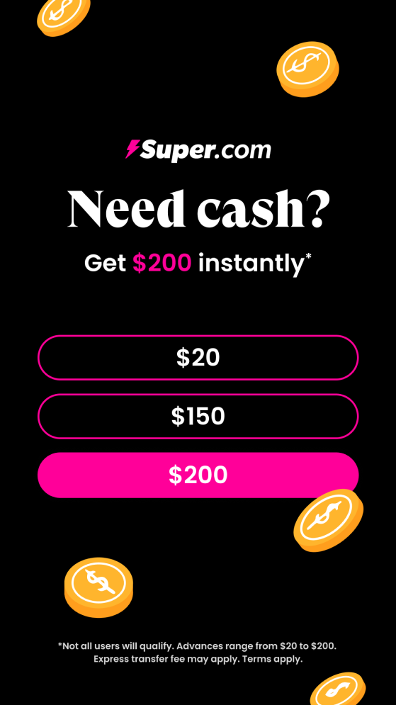
Meta Ad
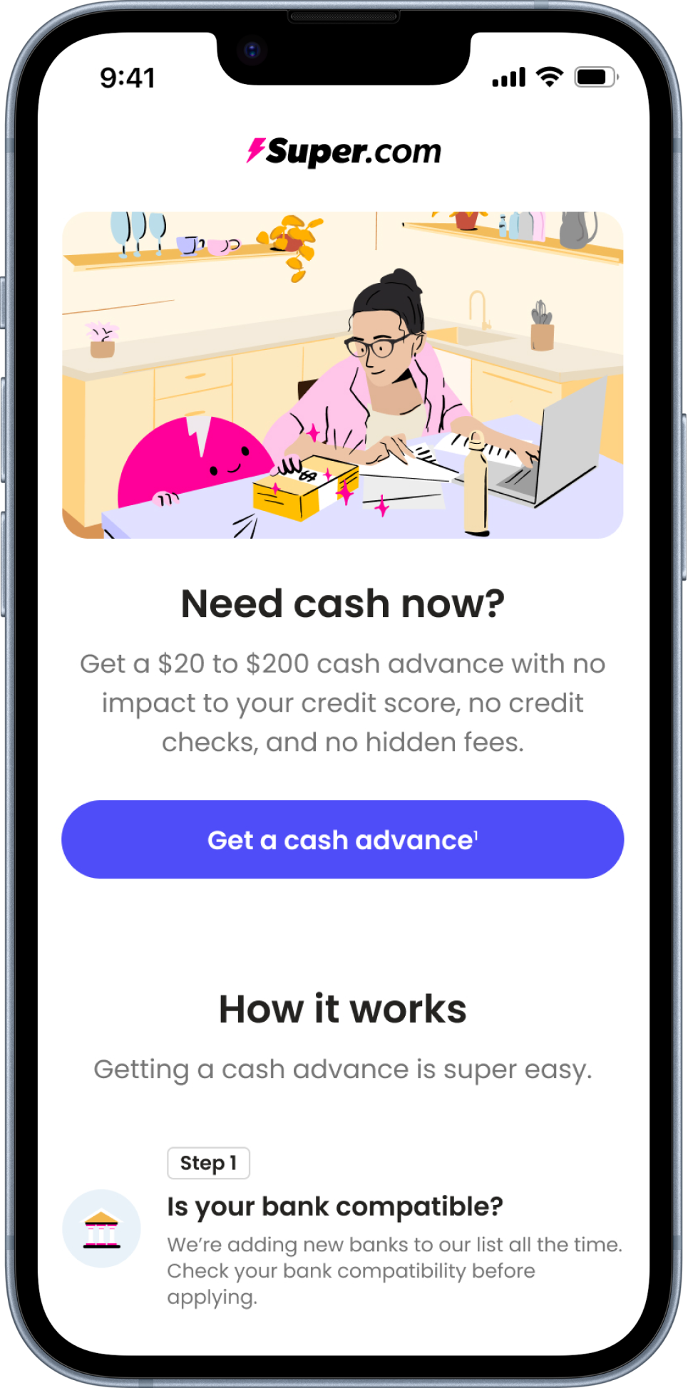
Previous Landing Page
Meta Ad
Redesigned Landing Page

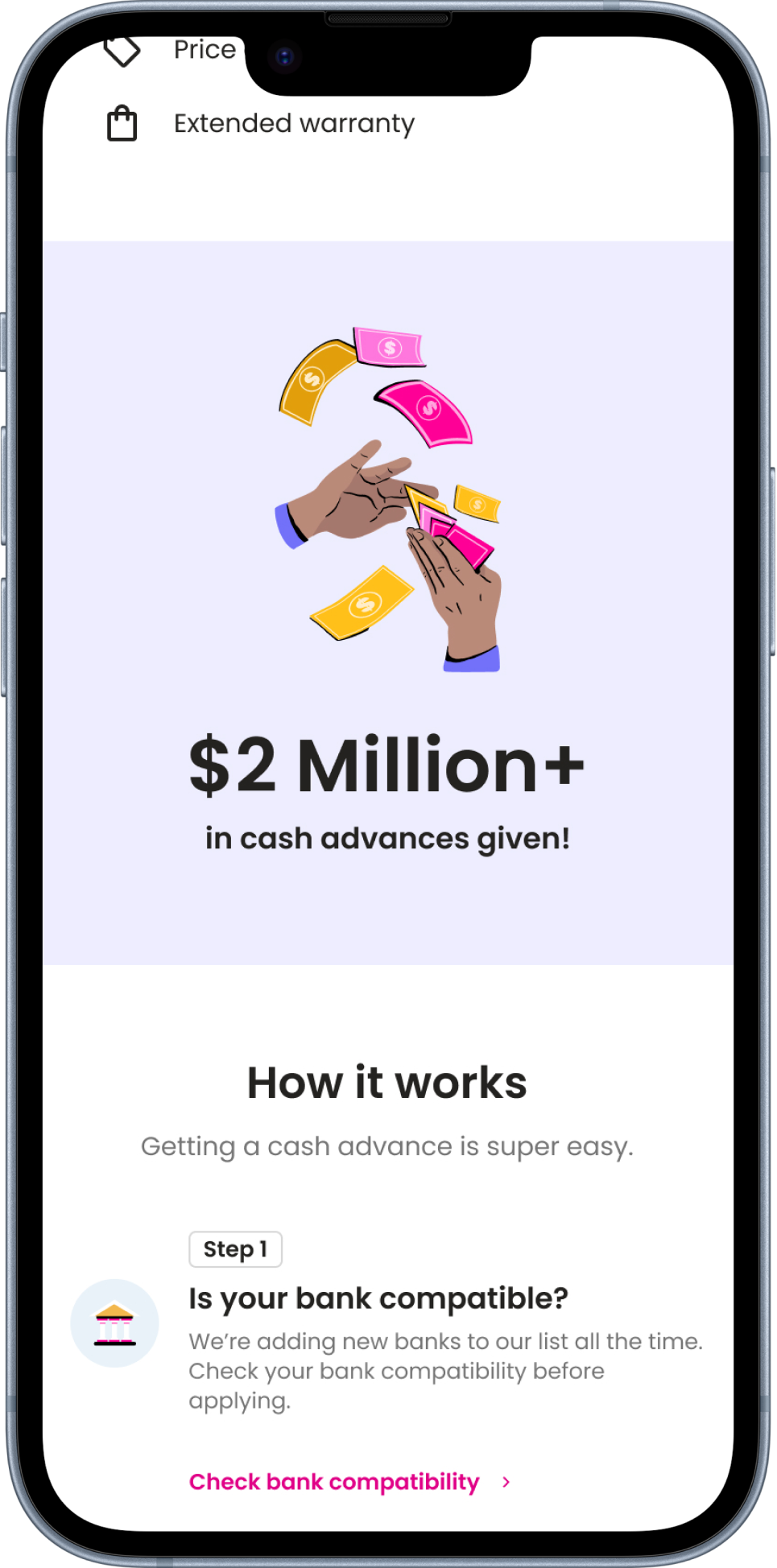
Social proof to build trust
We noticed that the previous landing page lacked social proof, and our team hypothesized that by incorporating where we’ve been featured and highlighting the number of cash advances we've provided, we could enhance user trust and boost the product's credibility. This also aligns with our overall brand strategy, as social proof is a key element showcased throughout our website and on the Google Play Store.
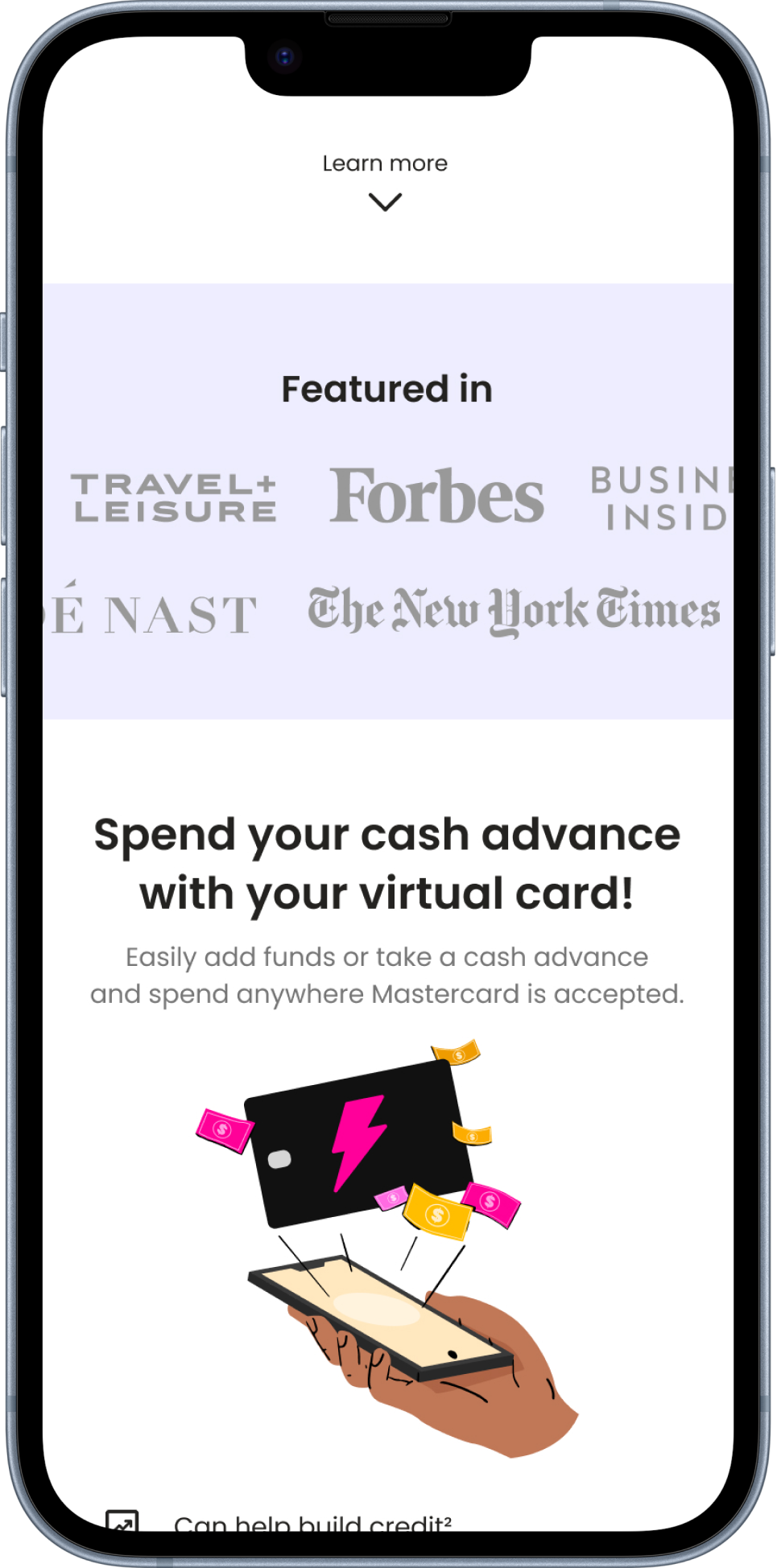
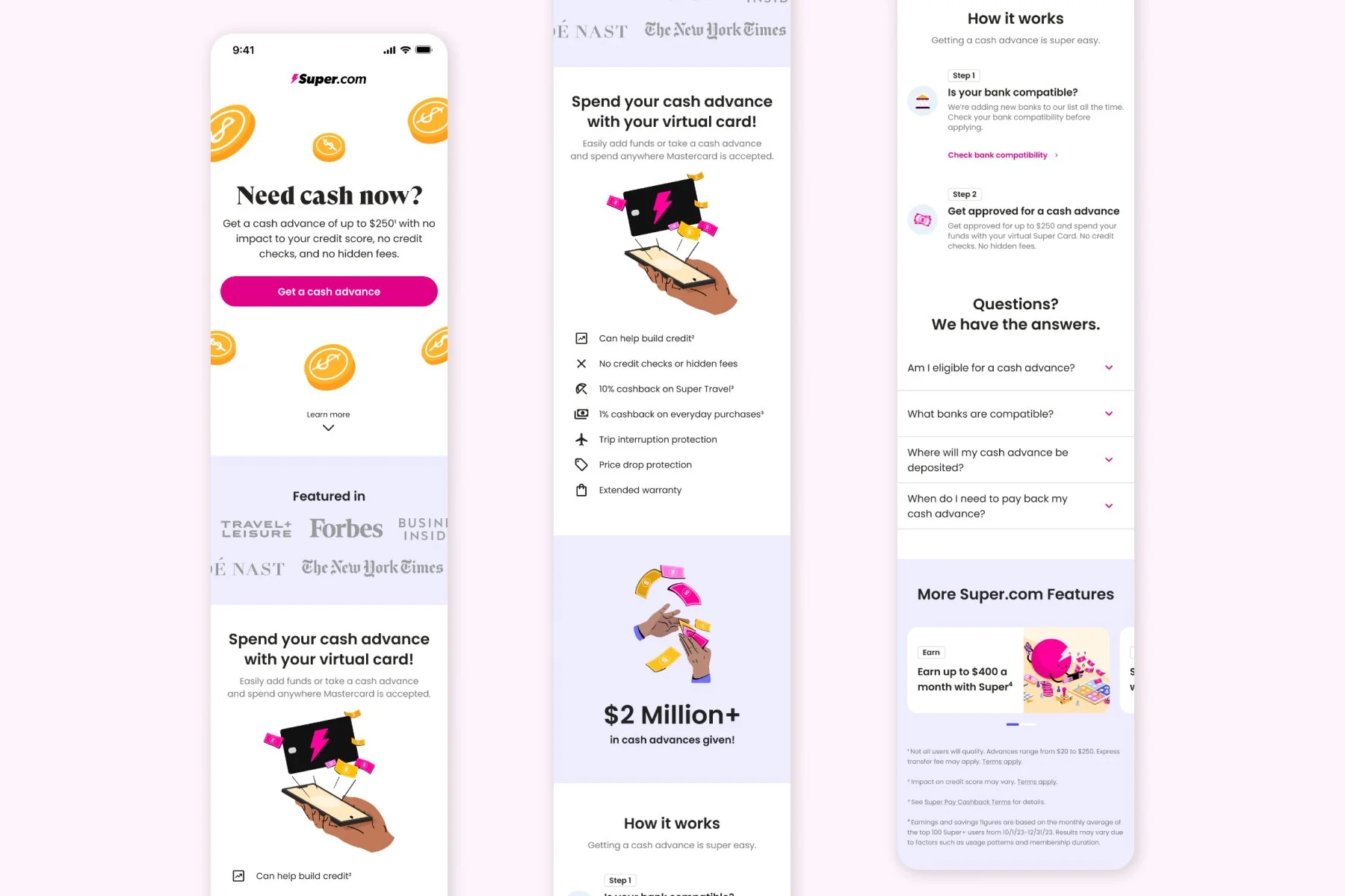
Transparency in design
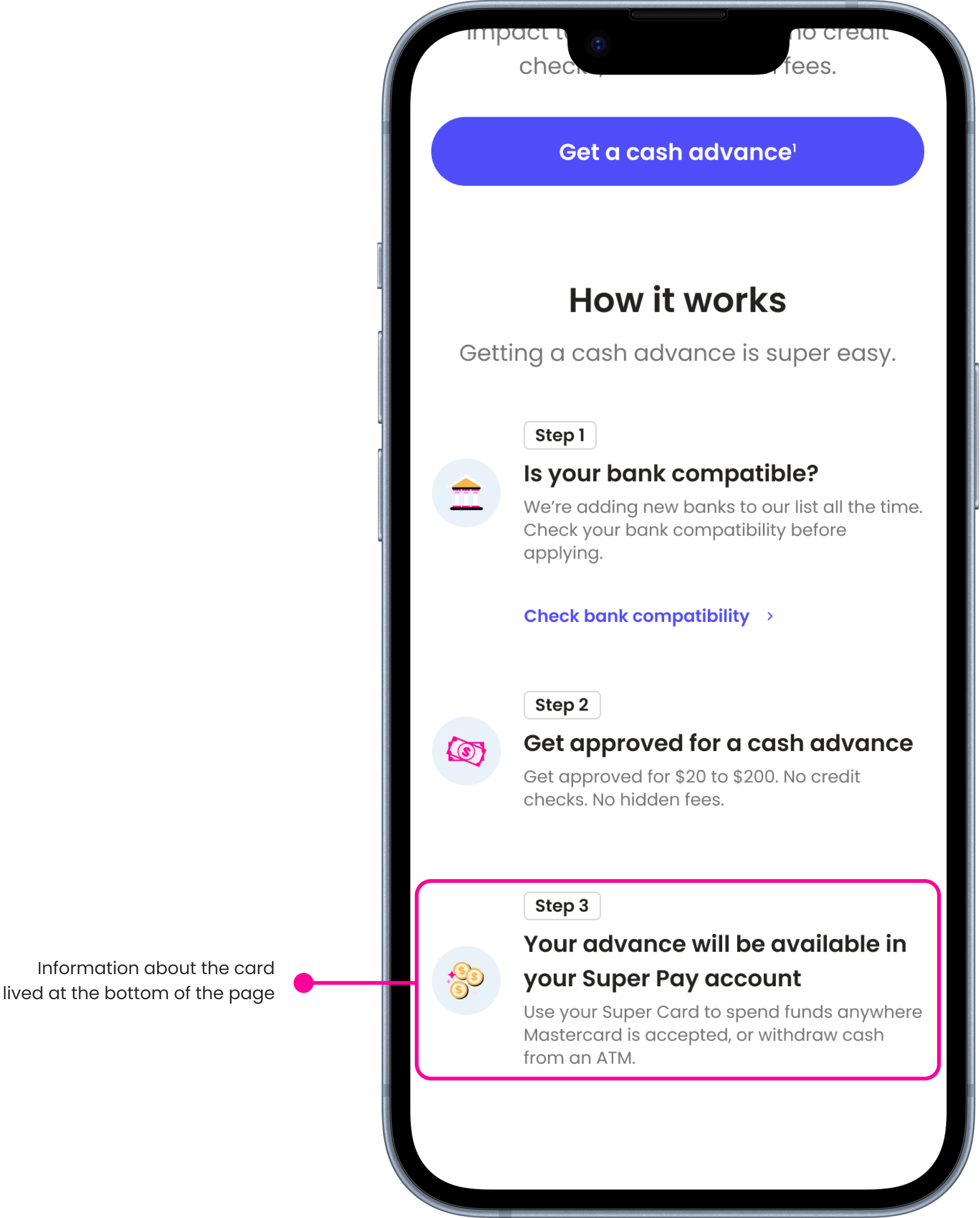
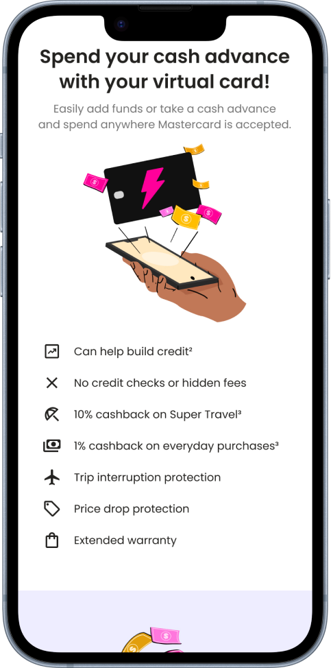
The previous landing page didn’t make it clear that users needed to use their Super.com Card to spend their cash advance. Most of the information about the card was buried in small text at the bottom, which led to confusion and a lot of complaints from users trying to withdraw or transfer funds to their bank accounts. To fix this, I revamped the page to highlight key details and benefits of the Super.com Card right at the top, so users understand the process upfront.
Previous Design
Redesigned Landing Page
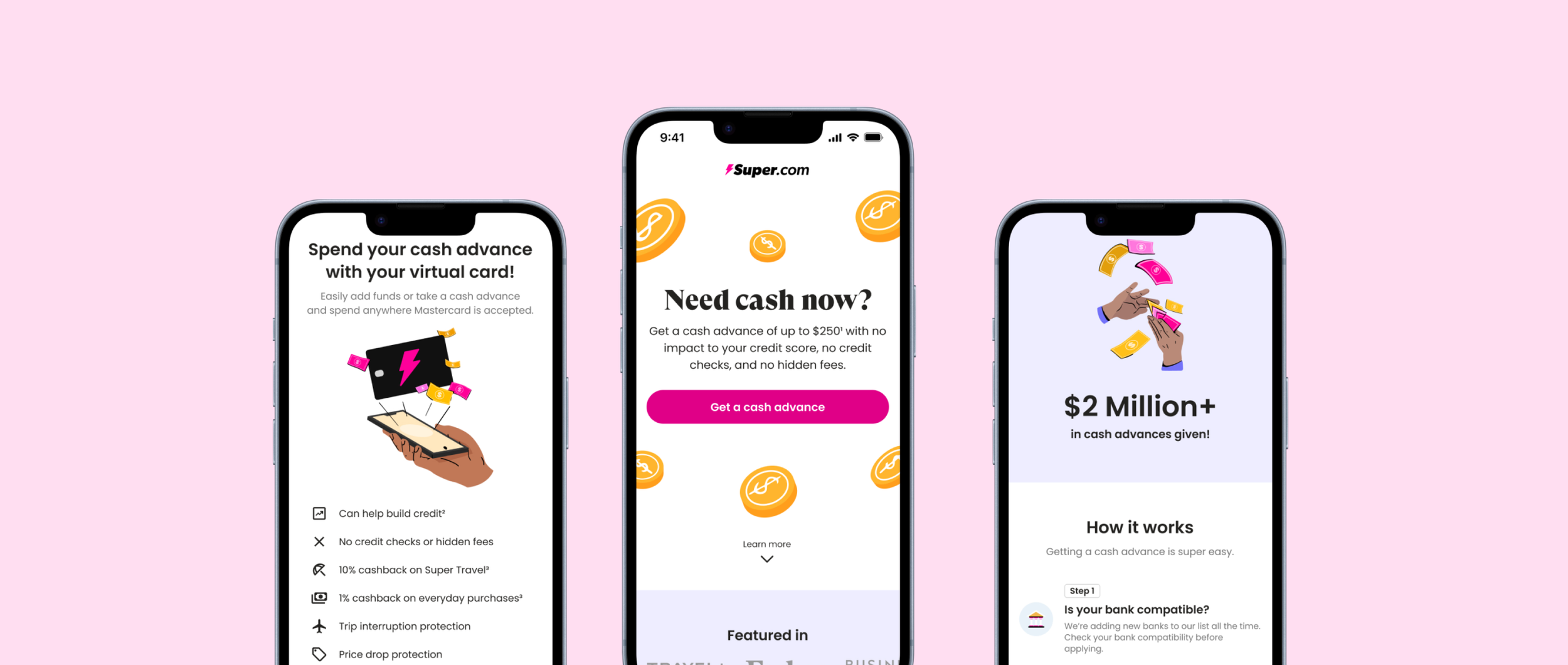
Final Experience & results
11.4% relative increase in click-through rates, indicating enhanced user interest and interaction with the landing page.
There was a 9.5% relative increase in Super+ conversions
75% of users scrolled far enough to see the card information, and 50% reached the bottom of the page. Previously, only 50% of users scrolled halfway down the page.