

Branding & Illustration Library: Cosmic Rewards
Cosmic Rewards is a loyalty reward Android app with over a 4-Star rating on the Google Play Store. Users can discover new apps to play/interact with and redeem Stardust (in-game currency) for gift cards. As one of the designers on the team, I was tasked to brand the product and create an illustration library that can be utilized across all platforms such as the app, website and social media.
What I did: Logo Design | Illustration
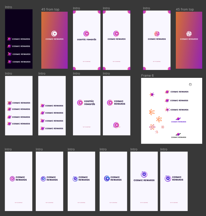
Logo Exploration
The previous logo lacked the flexibility to scale across the product and social media platforms. The client wanted a simpler, more adaptable solution. The goal was to create a logo that works seamlessly at any size, performs consistently across all platforms, and leaves room for playful, dynamic animation.
Previous logo

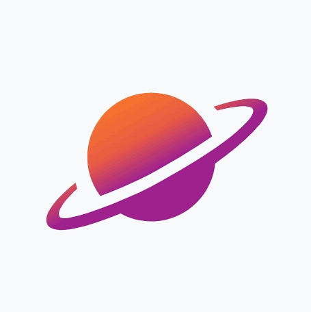
Final Logo
The new direction focused on simplicity and flexibility, making the logo easy to scale across the product and social media. It works just as well on dark and light UI, which gives the client way more freedom in how and where it’s used. Because of that, the logo can live anywhere and still feel clear. Also, playful animation was able to be added!
Example displayed for Dark & Light UI
Loader use throughout the product
Side-by-side logo

Stacked logo

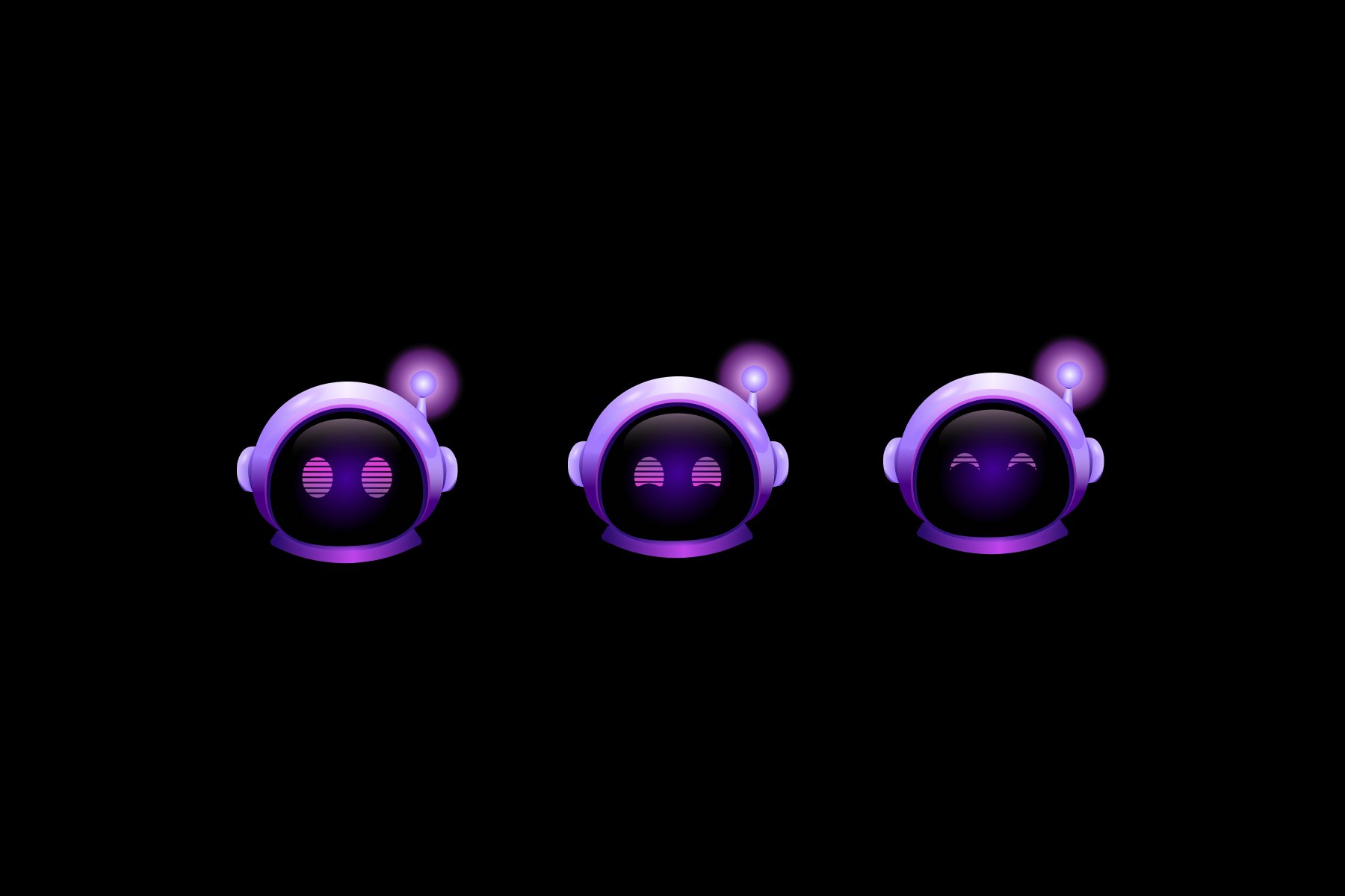
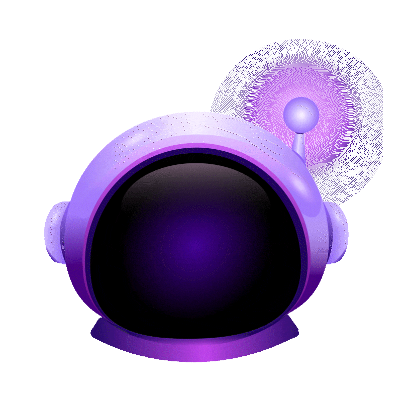
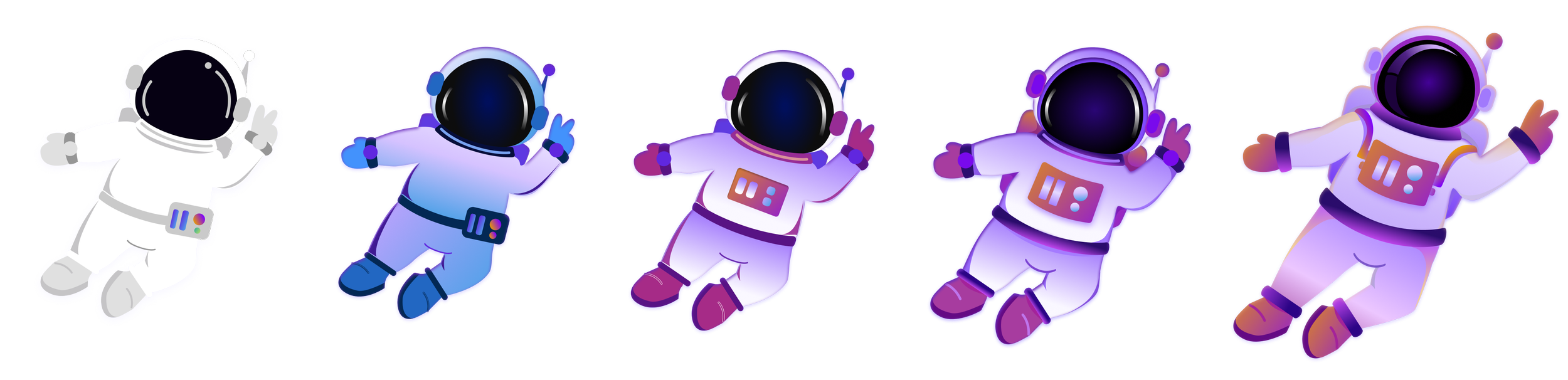
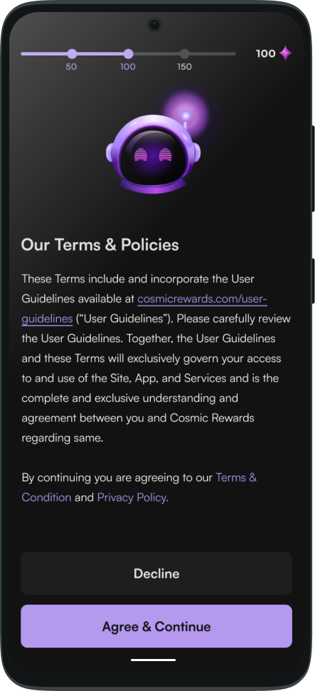
Captain Cosmo
Creating Cosmo, the mascot for Cosmic Rewards, was a process that required time and several iterations. My primary goal was to design a memorable character while utilizing our Primary Purple & Gradient theme. This allows users to both enjoy and easily recognize across the app and social media platforms.
To ensure consistency in Cosmo's appearance, I established a set of guidelines. Cosmo’s color scheme must remain uniform throughout the product, with the exception of social media contexts. Additionally, Cosmo should not appear in app avatars, and facial expressions are only permitted when the image focuses solely on Cosmo's face.
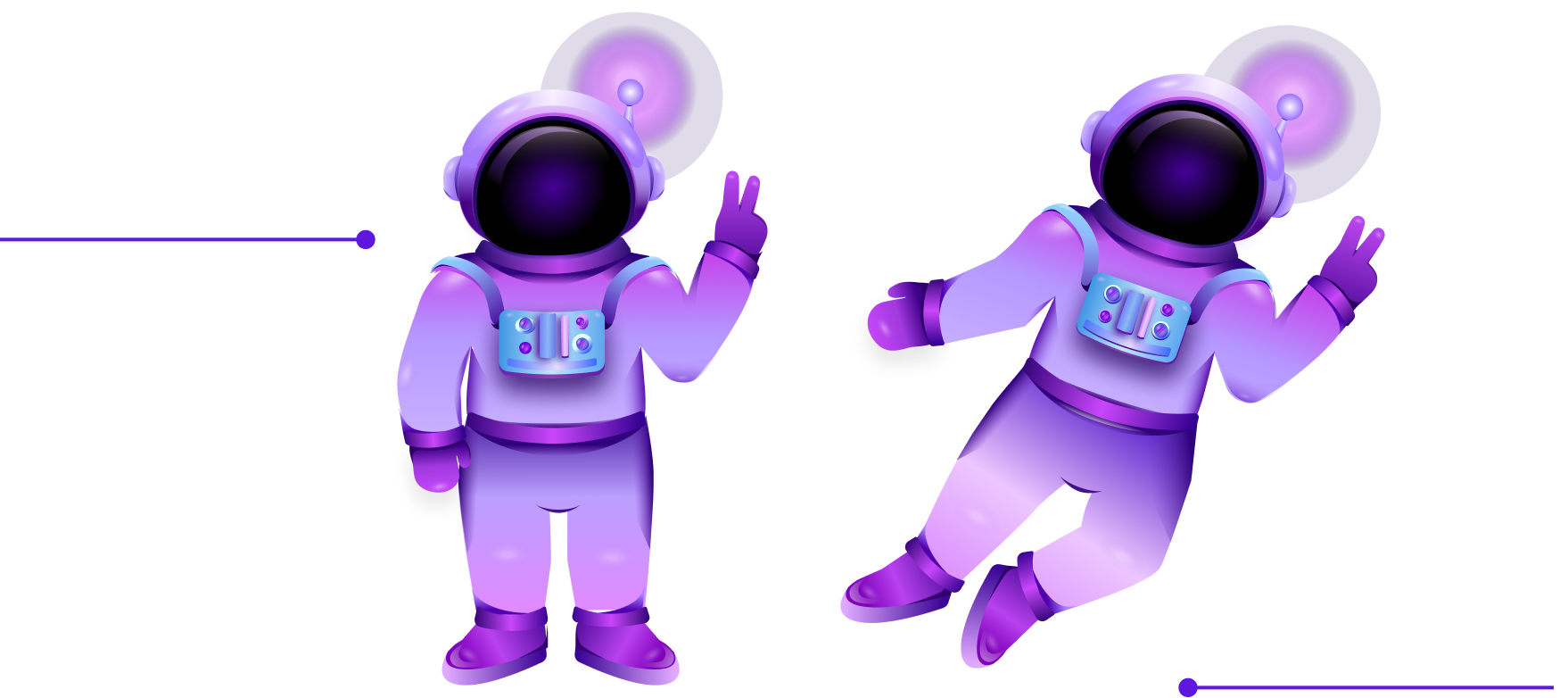
Captain Cosmo’s evolution
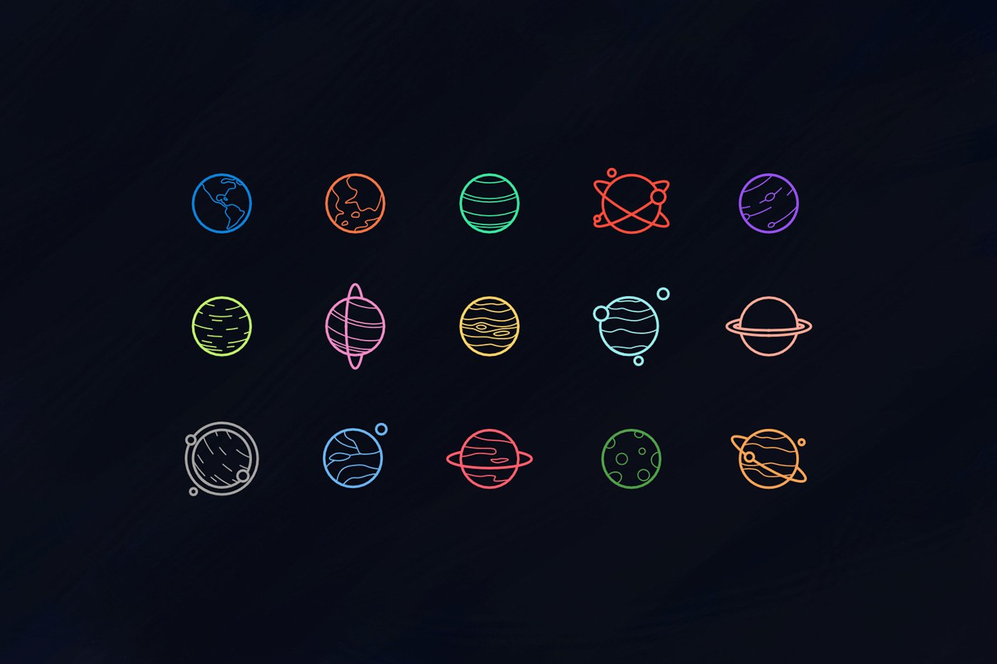
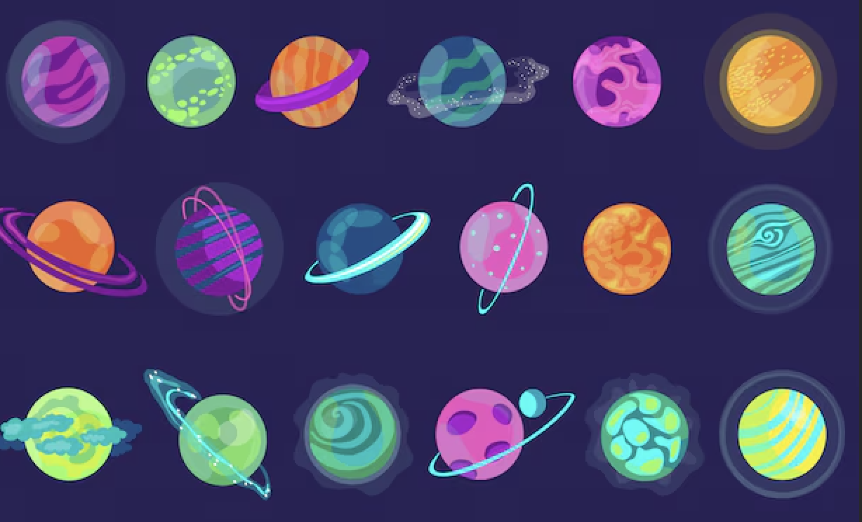
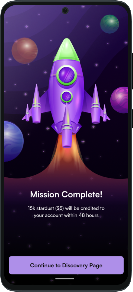
Spot Illustrations
Creating spot illustrations for the product and social media was a smooth and cohesive process. I expanded the Product design system colors to develop a vibrant theme, ensuring the use of consistent gradients throughout the graphics. This approach unified the visuals, making them feel like they all belong to the same cohesive universe within the app.
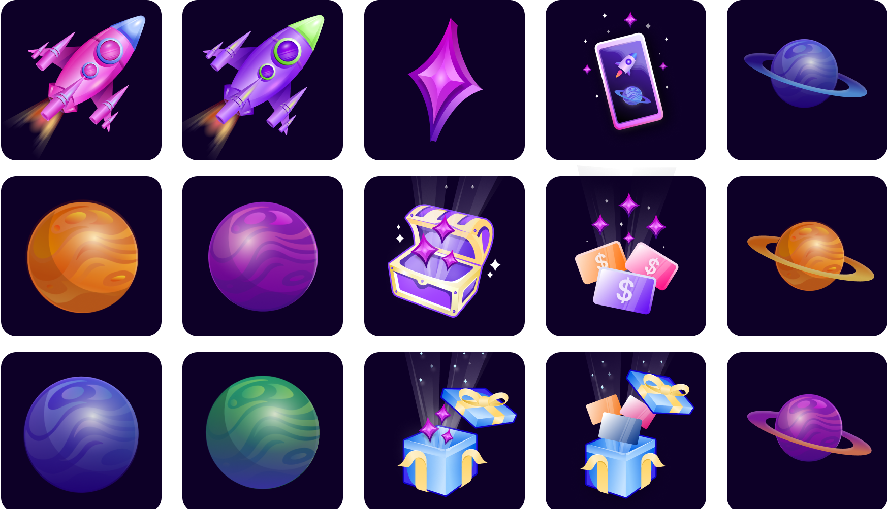

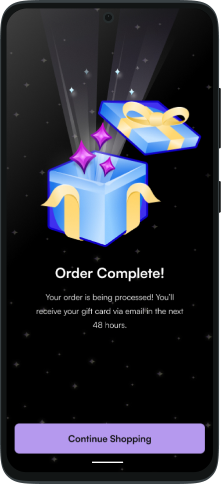
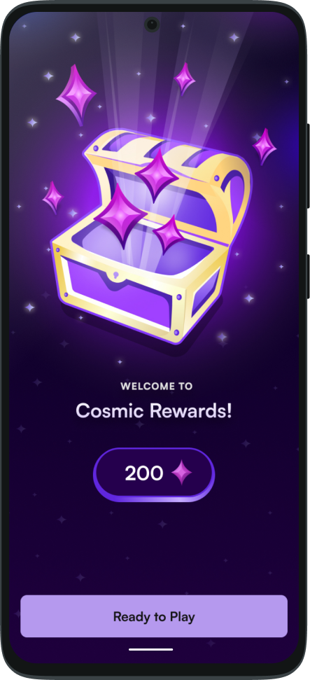
Illustrations Throughout The Product
Key wins
During User Interviews and Surveys, User's have complimented the overall visuals and theme of Cosmic Rewards.
Interactions with full-screen pop-ups in the App increased, leading to more Game Downloads.
Increased Social Media Following (interactions) by 200+%