Branding: Nuestro Chicago Archives
Nuestro Chicago Archives is a digital archive that highlights and preserves Chicago’s Latine community through photographs. The owner of Nuestro Chicago Archives is beloved within the community and has hosted several events. They have also spoken at the Museum of Contemporary Art in Chicago. Due to its growing popularity, the client wanted to fully brand their organization for their one-year anniversary event.
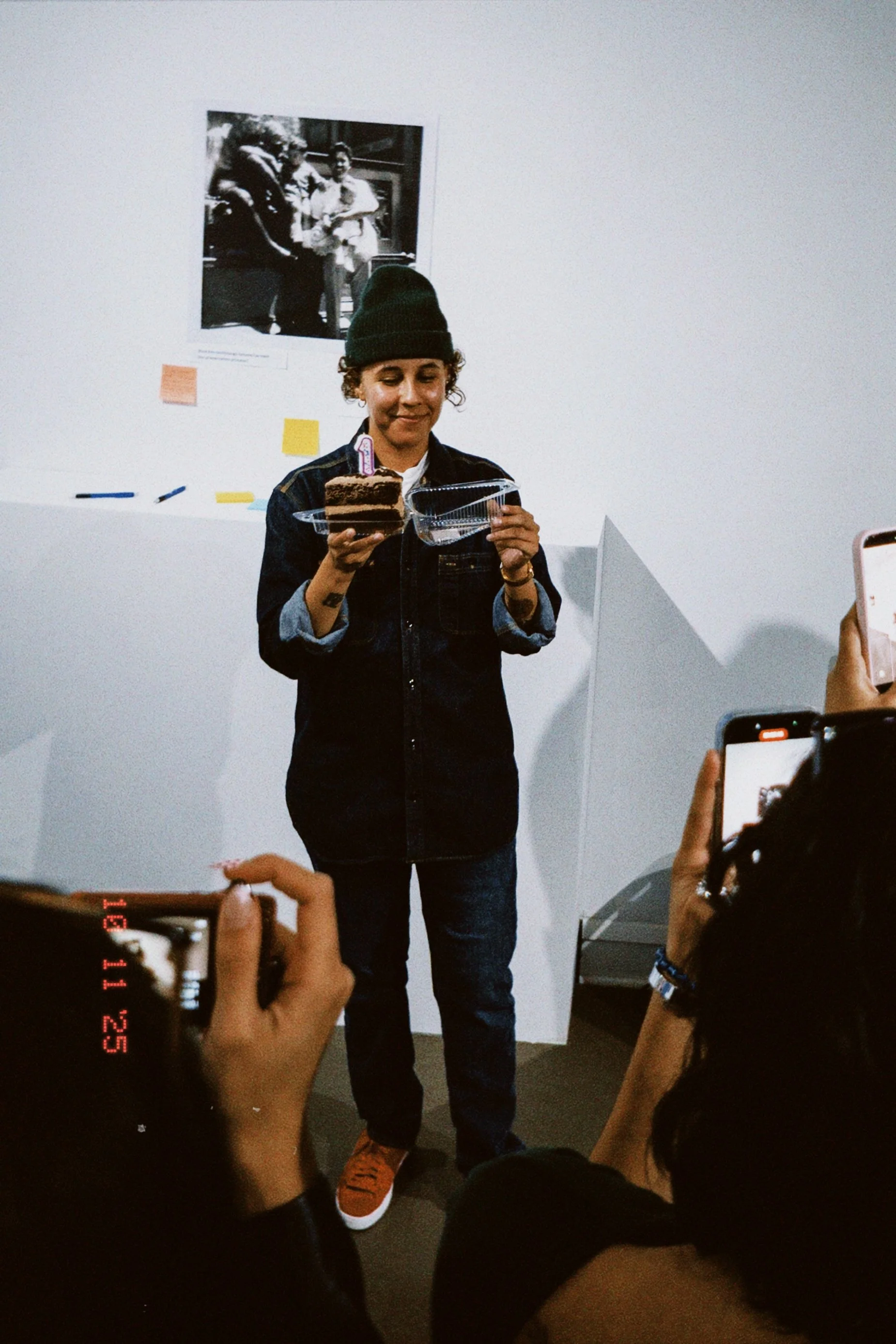
All in all, the branding was a success. The client and I collaborated on the merch and marketing materials which led to a turn out of 100 people, and 100% merch sold.
What I did: Brand | Type Design | Print | Merchandise
Type Exploration
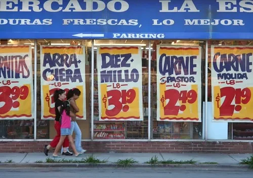
The client provided me with a mood board filled with images of the Mexican grocery store signs and rounded fonts. Taking in the client’s inspiration, I was able to create a unique typeface for them that felt in line with their rounded typefaces in their board, as well the retro-style feel that they wanted.
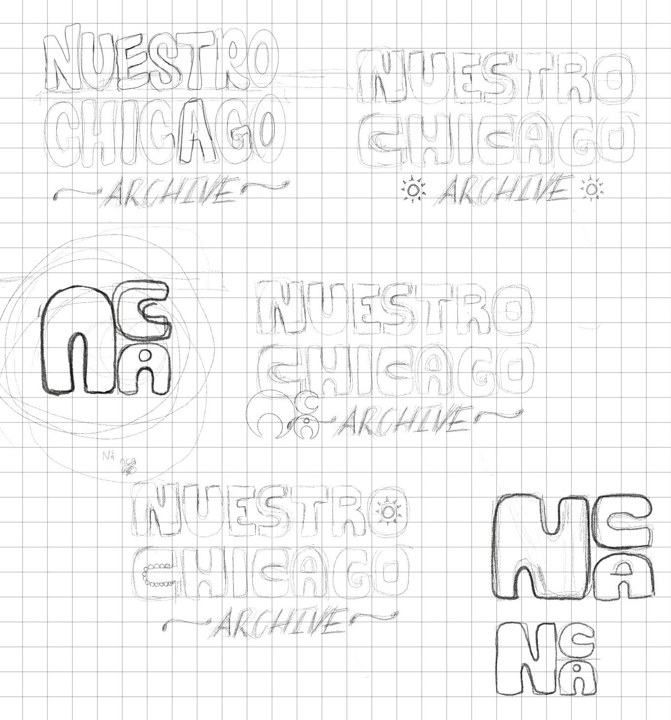
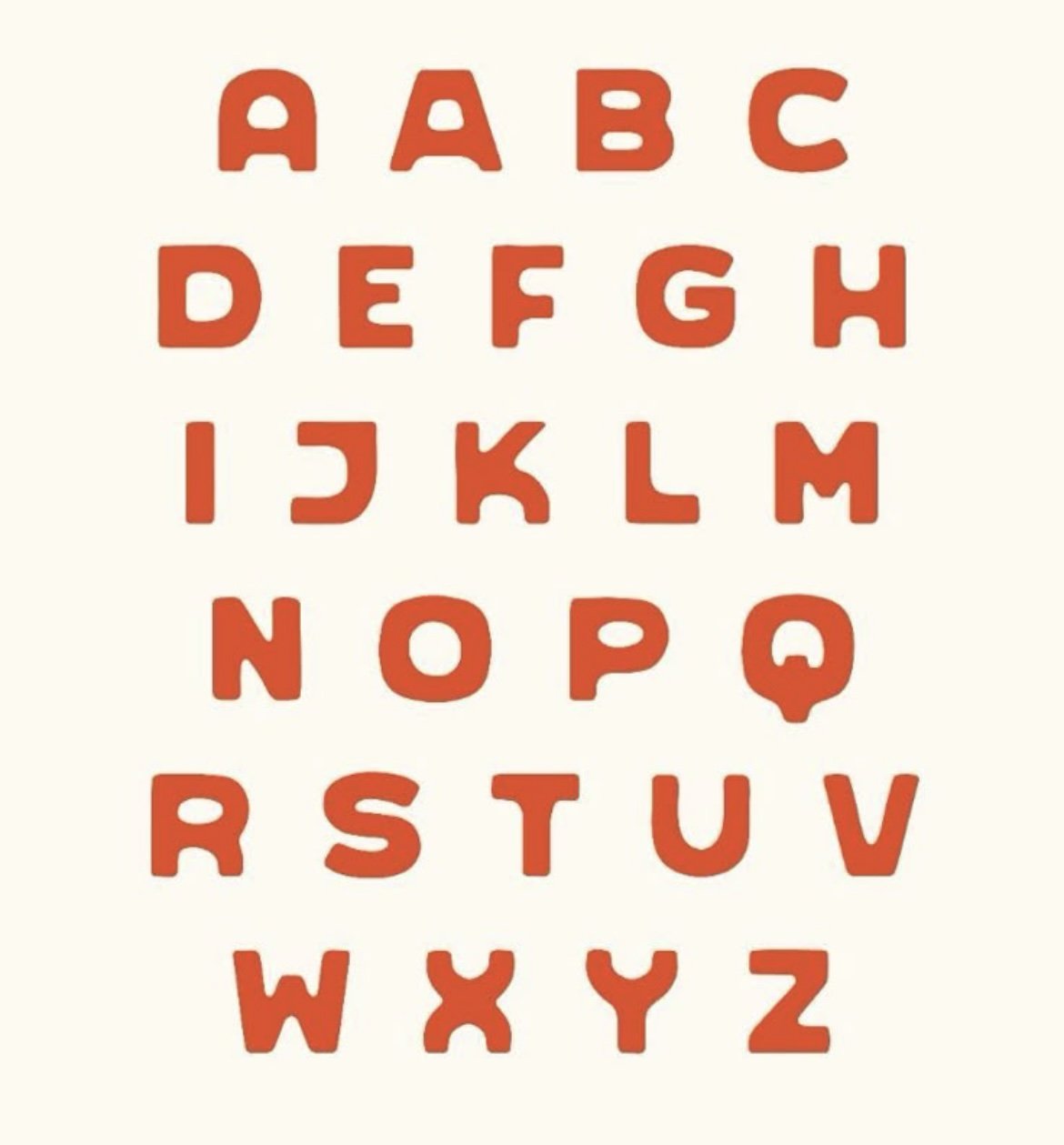
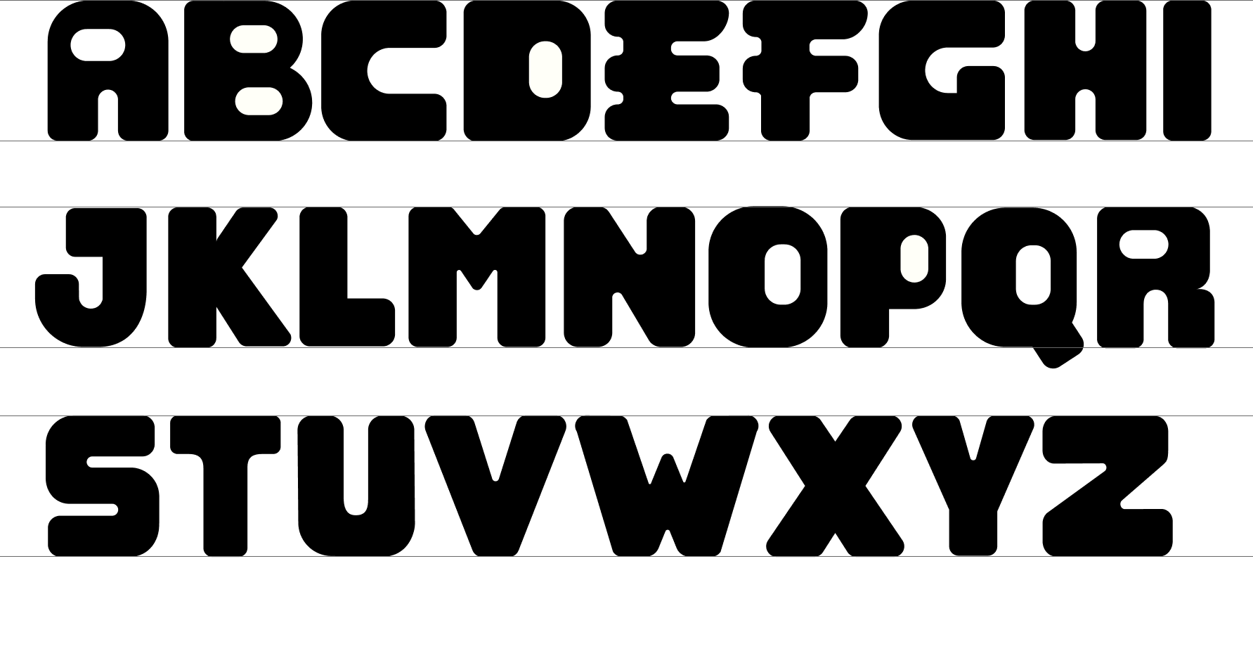
Final Typeface: XICAGO
The typeface name was created by the client. As their designer, I wanted them to have full automany when it came to these creative choices as well.
Final Logo
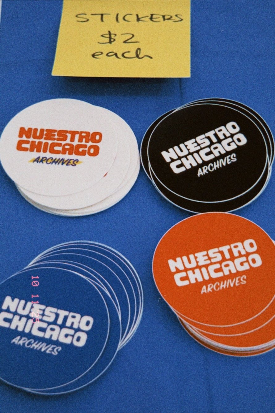
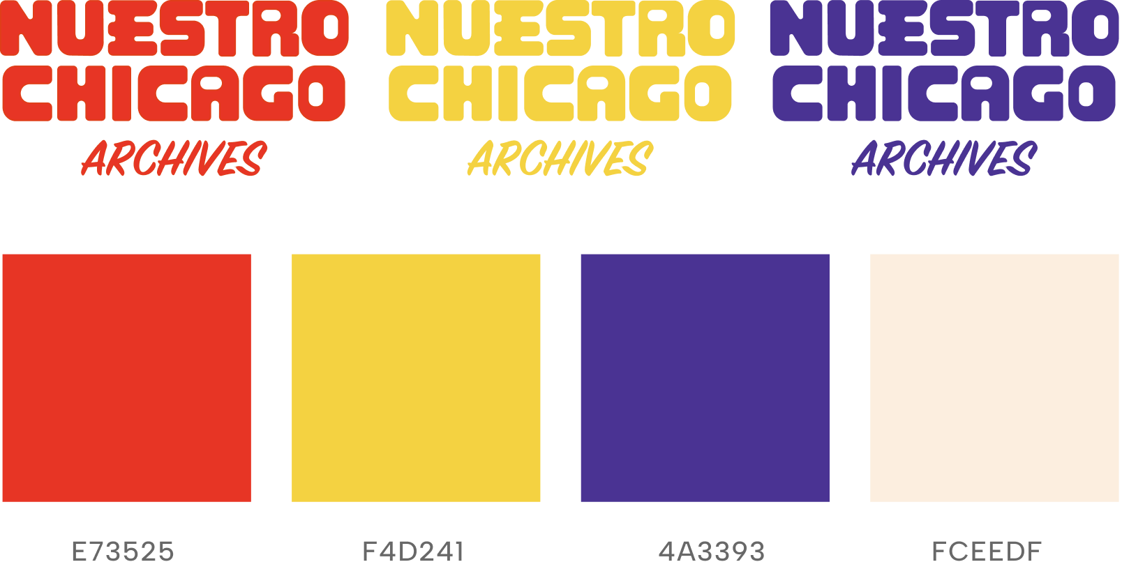
With the word “Archives” I went with a marker-style typeface with a yellow highlight in the background to reflect the grocery store sign style that my client wanted. Their core name “Nuestro Chicago” in the unique typeface. My goal was to stay consistent throughout the branding process, but also give my client enough variation so they can utilize their logo on multiple collateral such as print, socials and merch.
One Year Anniversary Exhibit
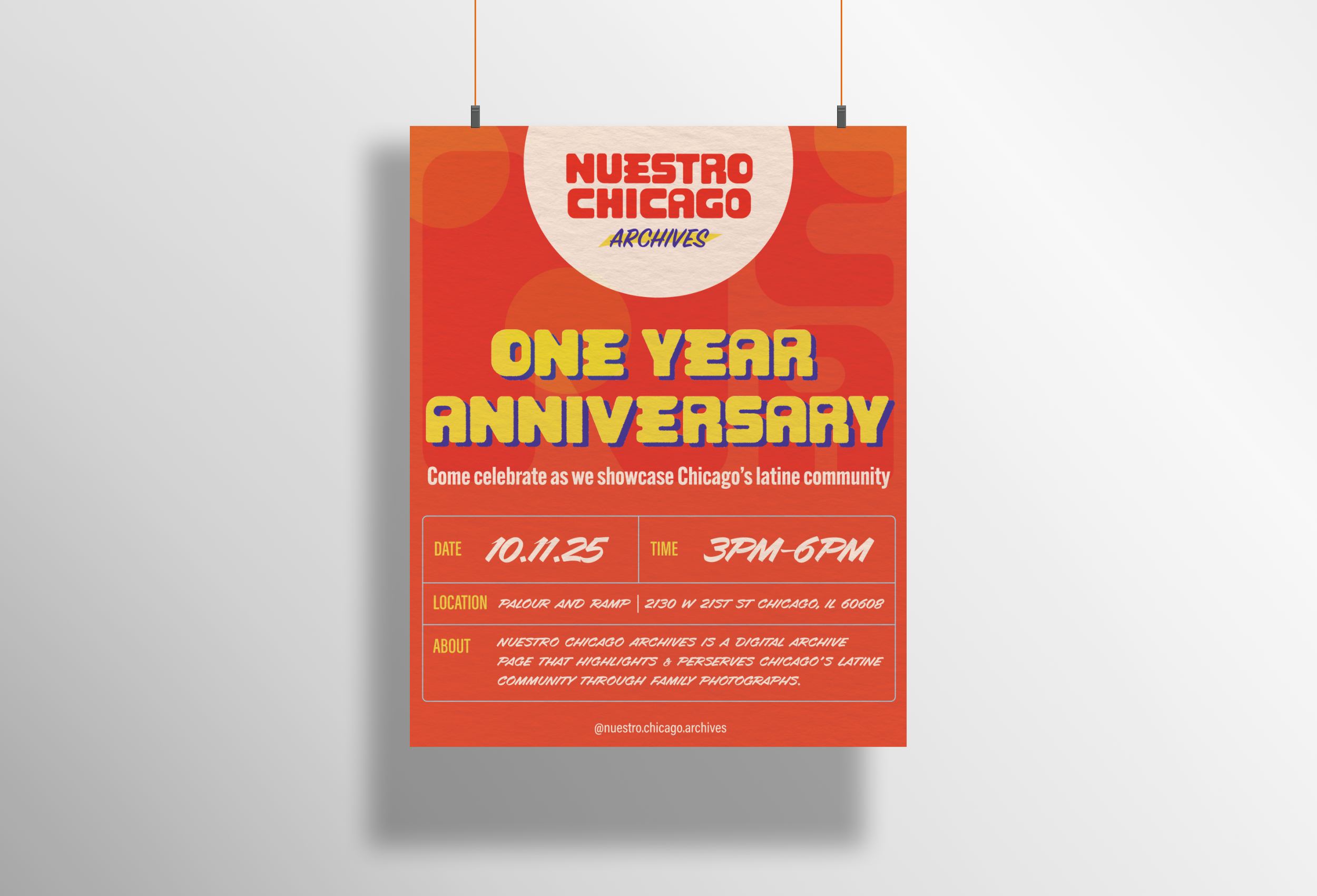
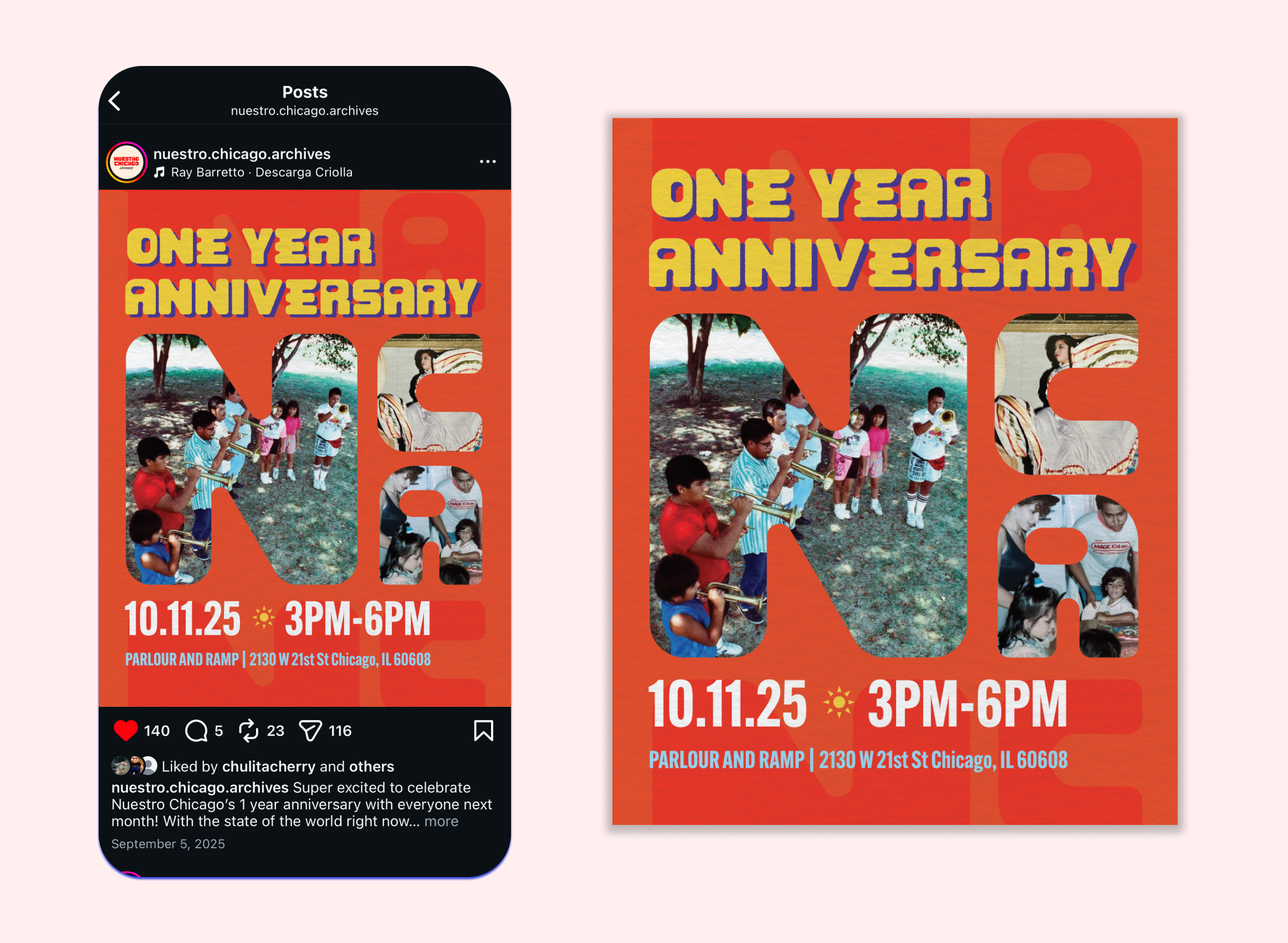
In order to market their one-year anniversary, I provided my client with both digital and print advertisements that they could post digitally or around the city. This allowed the client to reach out to people who are both online and offline.
Designing a different version for print vs digital was done intentionally. With a digital poster, there’s opportunity to play with imagery and type to stop a person from scrolling. Vs with print, the logo and headline is larger and bolder so people could have context on who owns the event.
Merchandise for Exhibition
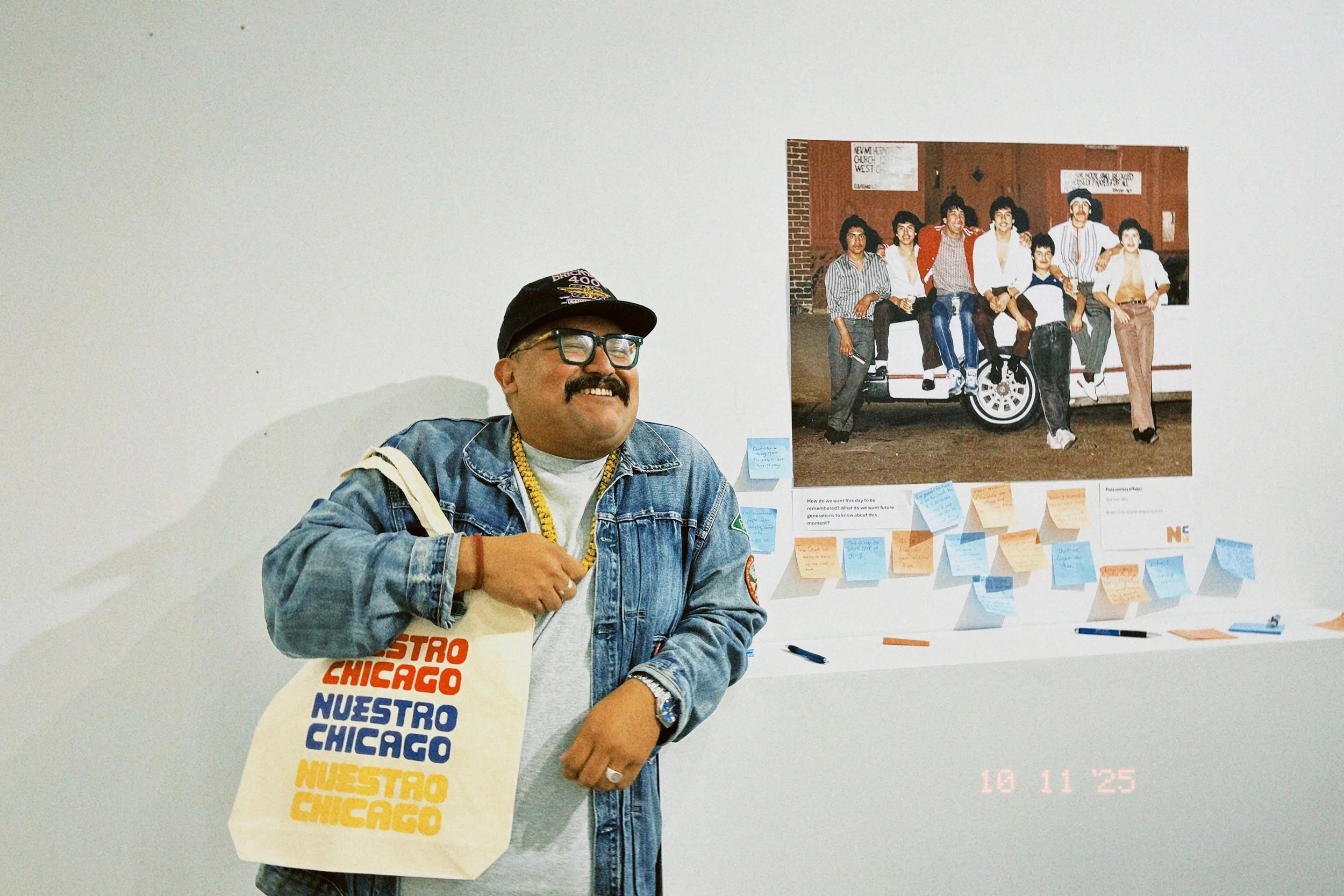
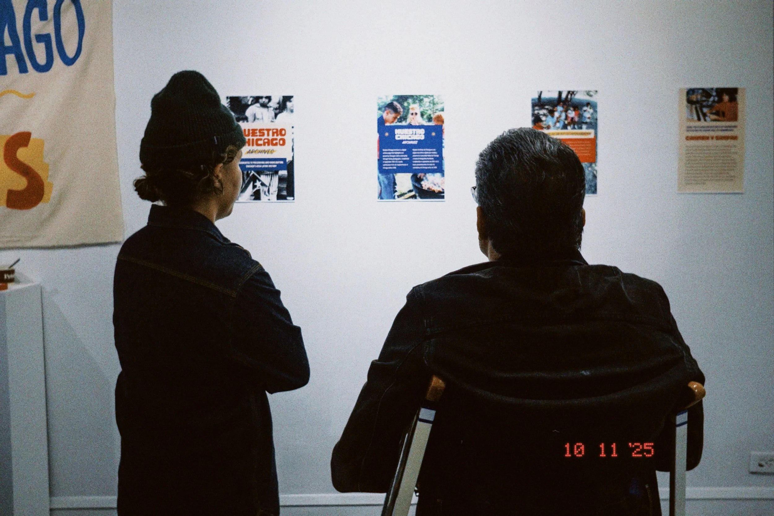
The client wanted merch to sell during their exhibit which involved stickers and tote bags. The merch was successful, leading with 100% merch sold. As their brand designer, I also got the opportunity to help set up the exhibit and create “About Us” designs so people can read more about Nuestro Chicago’s mission.
